November 17, 2021
in
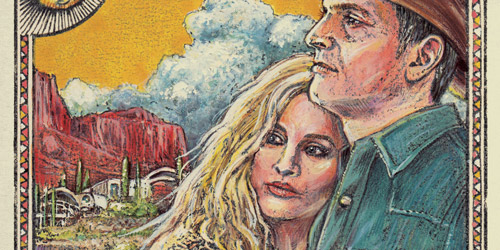
03. Far Out Wedding
[vc_row][vc_column][qodef_custom_font font_family="Montserrat" font_size="24" line_height="34" font_weight="700" letter_spacing="-0.4" text_align="left" content_custom_font="A Space Western with A Modern Twist" color="#222222"][vc_empty_space height="20px"][vc_column_text]I worked closely with the bride and groom to develop a far-out concept to match the wild western venue of Arcosanti, Arizona. Using sci-fi and western posters as inspiration, I crafted this one-of-a-kind set of invites to tell their story. [/vc_column_text][/vc_column][/vc_row]...
Continue Reading